"I started off as a designer with illustrative sensibilities, but now my work is illustration informed by design."
Meet
Andrew Kolb. Andrew is a Canadian Illustrator and Graphic Designer. His portfolio is filled with colorful imagery, personality, and interactive and mobile characters, seen as greeting cards, gifs, books, illustrations, gallery works, and more! We have had the pleasure of including Andrew in several past Light Grey Art Lab Exhibitions, such as the
Night of the Exquisite Corpse,
Macro + Micro, Rolemodels: the Battle for Vyk'Tornaahl, Great Personality, and the current
Stacks Exhibition.
We are always impressed by the breath of his artwork, motivation, and enthusiasm to take on new projects. In this artist interview, we look forward to celebrating Andrew's work, thoughts on illustration, and some of his resources. You can also find more of his work on his
website and
blog here.
Hi Andrew. Can you tell us about your current studio practice?
I work from home and have a dedicated room. I'll sometimes doodle and sketch elsewhere but that's only for the casual stuff. I've found that keeping work contained to a specific space helps with staying focused and to step away when I need a break.
I work at all hours, but my usual schedule is to email/invoice/quote first thing in the morning and after lunch for half an hour or so. After that, I can focus on drawing without distractions by little requests. I also try to leave an hour of the day dedicated to personal projects or just doodling. With all of that said, there are some days that just become sending one email while three come in and the cycle never ends. As structured as I try to pretend my freelance life is, it's all very fluid.
 We are always impressed by the amount of creative projects you participate in. Could you talk about the difference in creative for freelance, personal projects, greeting cards, exhibitions, etc.?
You're too kind! I'm not sure if there's toooooo much method to my madness. My client and professional work gives me the chance to meet the needs of others, so I use personal projects and gallery work as the opportunity to meet my own. With personal projects, I typically try to avoid pandering with popular and trendy ideas- the public is smart and will see right through this approach.
I think personal projects should be done because you truly believe in it! If you're satisfied with an image on a personal level then, hopefully, you can get past whatever response it's met with. I mean it's great if others like what you do, but I think personal projects are just that...personal, and expecting any interest beyond your own is purely bonus!
Do you have favorite materials, prompts, or subjects?
I love the flexibility of working digitally. With that said, I always have to start with a pencil sketch. For that, there's nothing better than a cheap BIC mechanical pencil (not sponsored, I promise). They're great! Always sharp and thus you don't have to waste precious drawing time with pesky sharpening; it's the perfect world.
Subject matter is often vaguely directed by the client/gallery/etc. but I do try to focus on the characters and their stories. I try to plot out a background narrative even if it's a simple character portrait. It may not be super complex, but it does help to inform the decisions I make like setting, body language, and so on.

Teeny Tiny Trip Through Time
Could you tell us about the project you chose for the Stacks Exhibition? Why was this subject important to commemorate and what was it like reliving that year?
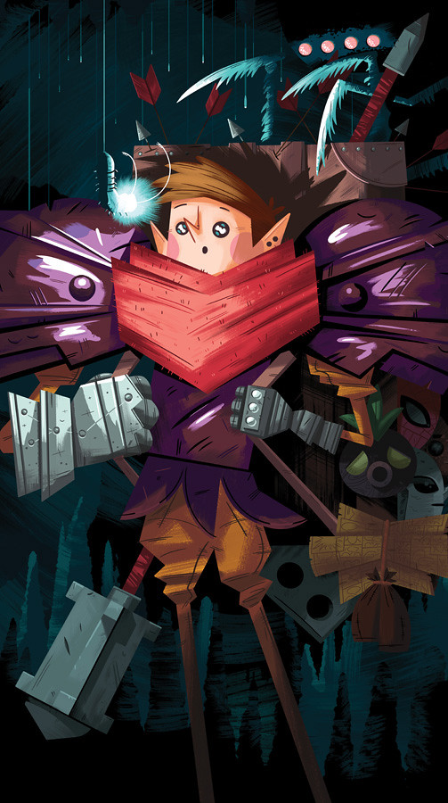
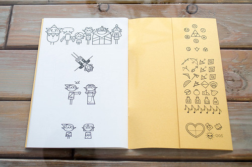
Ah...The Legend of Zelda: Ocarina of Time. So I suppose the best thing to do is quote the small introduction that's on the inside flap of my zine:
"The year was 1998.
I’m sure a bunch of really important stuff happened but I was 12 so what stood out to me was a video game.
For Christmas that year i was given The Legend of Zelda: Ocarina of Time, and it was awesome.
Looking back I appreciate so much more than the plot or the graphics. I mean everything about the game is still great, but there’s something more that left such an impression on me.
Around this time, I’d never heard of a Zelda game and my parents rarely took chances on something so expensive. The serendipity of them making such a great choice, without any prompting or research, just doesn’t happen anymore.
In the age of previews for movie trailers, it’s hard to come by genuine surprise and I appreciate that this game provided me with that. Discovery is what the franchise is all about and I couldn’t have had a truer experience than with this installment. That’s why I still love it to this day.
So to commemorate the year of its release I wanted to take this teeny tiny trip through time. Enjoy!"

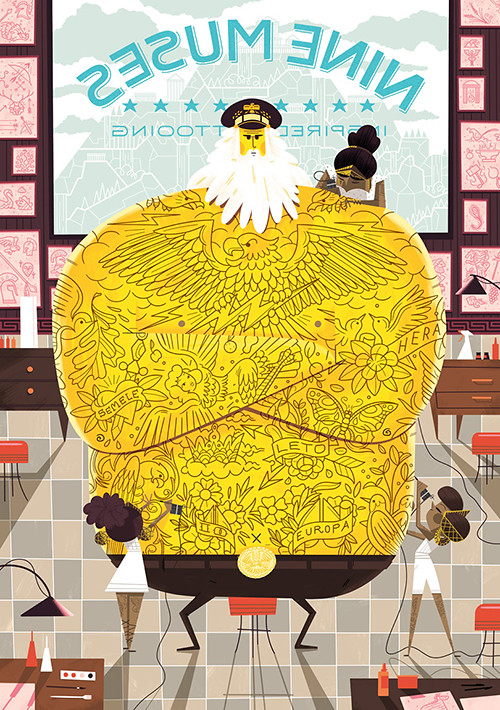
Mused on Tattoos Series- Young Guns of Print art show at Hero Complex Gallery.
What are you currently making? What can we look forward to seeing?
Well I've just gone back and revamped my personal project: The Silly Rally where I illustrate and animate goofy racers and their vehicles. I'm regularly updating and you can expect lots of "silly" from the series.
Oh but the BIG thing that's coming up is my first picture book! I haven't really talked about it that much yet but it's now available for preorder on Amazon so I should probably start promoting it, right? So it's called Edmund Unravels and it's about a little ball of yarn who adventures despite getting smaller as he goes and the importance of surrounding yourself with those you care about.
Other than that, I suppose there are more gallery shows and fun projects in the queue but all of those secrets are still kept under lock and key.
What is the best project you have ever worked on and why? (Personal or professional)
Like a good parent and their children, I'll never admit to having a favorite!
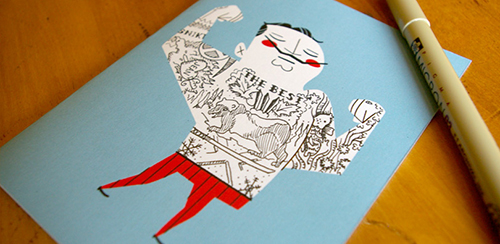
 Tattoo It Yourself Cards
What are your favorite resources/ inspiration?
My big-picture inspirational people are the likes of Mary Blair and Mike Mignola. While they're of a different time, aesthetic, and content, they both approach their work with a simplicity that quickly communicates tone and content. I'm always inspired by those who are visually efficient and If I can be half as effective as the likes of them, I'll be on my way.
Outside of the art world, I'm an avid reader and love seeing how pictures are crafted with the written word. In the same way, I'm amazed when an author can take two relatively simple sentences and immediately paint a vivid mental picture. I don't have any direct examples to source but I'm reading "Neuromancer" by William Gibson right now and he's definitely concise in his writing.
Thanks Andrew!
You can find more information about Andrew's work for the Stacks Exhibition on the
Light Grey Shop or
permanent online gallery here. You can also see his process sketches and upcoming works on his
blog and
website!


